Frutiger Aero Nostalgia: Exploring the Aesthetic of a Lost Future

In the ever-changing world of design and digital culture, few aesthetics resurface with the same emotional resonance as Frutiger Aero Nostalgia. This term refers to a design style that dominated the early to mid-2000s, combining glossy user interfaces, vibrant gradients, translucent panels, and sleek typography inspired by the Frutiger typeface. For many, revisiting this style feels like stepping back into an era of optimism about technology, globalization, and ecological balance — an era that promised a utopian future we never fully achieved. As younger generations rediscover this aesthetic on platforms like TikTok, Reddit, and Instagram, the concept of Frutiger Aero Nostalgia has become a cultural phenomenon. To understand why it has returned so strongly, we need to explore its origins, visual traits, and the emotional weight it carries.
What Is Frutiger Aero?
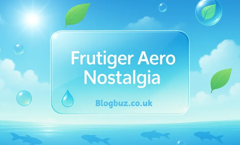
Frutiger Aero refers to a design language that emerged around 2004 and lasted until the early 2010s. It was heavily influenced by Microsoft’s “Aero” interface in Windows Vista and Windows 7, as well as by corporate branding from companies like HP, Dell, and Sony. The “Frutiger” part of the name stems from the clean, modern sans-serif typography often used in this era, reminiscent of Adrian Frutiger’s typeface design.
The result was a hybrid aesthetic: futuristic yet approachable, digital yet deeply tied to natural imagery. It featured glossy, glass-like elements combined with bright skies, flowing water, fish, greenery, and eco-friendly motifs. In short, it was design optimism made visual.
The Rise of Frutiger Aero in the 2000s
The early 2000s marked a period of rapid technological advancement. Broadband internet became widespread, personal computers were increasingly accessible, and tech companies wanted to project a hopeful vision of the future.
Frutiger aero nostalgia today stems from reminiscing about the golden age of technology branding, when advertisements and software interfaces celebrated clarity, transparency, and ecological harmony. It was not uncommon to see laptops floating over blue oceans, mobile phones paired with images of fresh grass, or websites adorned with lens flares and glossy buttons.
This aesthetic aligned perfectly with the Web 2.0 era — the transition to more user-friendly, interactive online experiences. It represented an optimism that technology could solve environmental issues and bring people closer together.
Visual Characteristics of Frutiger Aero Nostalgia
To recognize Frutiger Aero nostalgia, one only needs to look for its distinct visual hallmarks:
- Gloss and Transparency: Windows Vista’s Aero theme epitomized the glassy, translucent panels that defined the look.
- Gradients and Glow: Smooth color transitions, often in blues and greens, created a futuristic, polished effect.
- Nature motifs, such as fish, trees, clouds, and water ripples, symbolized harmony between technology and ecology.
- Sans-serif Typography: Minimalist, legible typefaces gave designs a modern corporate feel.
- 3D Bubbles and Orbs: These elements suggested innovation and digital fluidity.
Together, these components made the aesthetic stand out from earlier minimalist trends and from the flat design that replaced it in the 2010s.
Why Does Frutiger Aero Nostalgia Resonate Today?
The renewed fascination with Frutiger Aero nostalgia is tied to several cultural and psychological factors:
- Longing for Optimism: Many people feel uncertainty, climate concerns, and digital overload dominate today’s world. Looking back at an era that promised a clean, green technological future provides comfort.
- Generational Memory: For Millennials and early Gen-Z, this aesthetic coincided with their formative years. It recalls the first laptops, MP3 players, and early social networks.
- Contrast to Minimalism: After years of flat design and corporate branding stripped of detail, the glossy and vibrant look of Frutiger Aero feels refreshing.
- Retro-Futurism: It represents a “future that never happened.” Nostalgia is not just about memory — it’s about reimagining what could have been.
Frutiger Aero Nostalgia in Social Media Culture
The revival of Frutiger Aero nostalgia is not accidental. Platforms like TikTok and Instagram thrive on aesthetic subcultures. Users create moodboards, edits, and AI-generated visuals that reimagine the mid-2000s dreamscape. Hashtags such as #frutigeraero and #frutigercore allow communities to share this collective longing.
Reddit communities and design blogs analyze its cultural significance, while influencers use the aesthetic for retro-inspired branding. Memes also play a role, with people humorously exaggerating old promotional material to highlight the naïve optimism of the time.
Criticism and Debate Around Frutiger Aero Nostalgia
Despite its popularity, Frutiger Aero Nostalgia is not without critique:
- Artificial Nostalgia: Some argue that people romanticize an aesthetic that they never truly experienced, especially when AI-generated images exaggerate its features.
- Corporate Packaging: Critics remind us that much of this design language was corporate marketing meant to sell products, not an organic art movement.
- Short-lived Appeal: Like all internet trends, there is debate about whether the current fascination will endure or fade as quickly as it returned.
Still, even these critiques underline its cultural significance — an aesthetic powerful enough to spark debate is one worth examining.
Modern Applications of Frutiger Aero Nostalgia
Beyond nostalgia, the aesthetic is inspiring contemporary design in various ways:
- Graphic Design: Designers incorporate glossy panels and eco-inspired motifs into posters, album covers, and digital art.
- Fashion and Merchandise: Prints, hoodies, and accessories inspired by Frutiger Aero nostalgia are available for sale online.
- UI/UX Design Experiments: Some developers experiment with reintroducing skeuomorphism into apps, blending it with modern minimalism.
- Music and Visual Media: Vaporwave and retro-futurist artists borrow heavily from its imagery for music videos and cover art.
Frutiger Aero Nostalgia and the Future That Never Happened
At its core, Frutiger Aero Nostalgia embodies a longing for a future where technology is seamlessly integrated with ecological harmony. It represents a utopia that was marketed to us but never truly materialized.
This is why it resonates so deeply — it is not just a design style, but a reminder of a cultural narrative about hope, progress, and optimism. In today’s climate of uncertainty, returning to this vision feels comforting, even if bittersweet.
Conclusion: The Enduring Power of Frutiger Aero Nostalgia
The resurgence of Frutiger Aero nostalgia reveals that aesthetics are more than surface-level decoration — they carry memory, emotion, and cultural significance. For many, it recalls the bright promises of the 2000s, when technology was still seen as a friendlier force.


