The Intersection of Architecture and Signage: Why Signs Are More Than Just Direction
Architecture is more than just buildings; it’s about how spaces make people feel, interact, and move. Every wall, window, and hallway is an opportunity to guide behavior. And one of the most overlooked yet impactful architectural tools is signage. From ADA signs that foster inclusivity to strategically installed identifiers that enhance navigation, signage plays a vital role in shaping the human experience within a space.
The best architects and designers understand this synergy. They know that signs aren’t just labels—they’re part of the built language that helps people make sense of where they are and where they’re going. Whether in commercial buildings, healthcare facilities, or public campuses, signage must work with the space, not against it.
The Role of Wayfinding in Spatial Design
Wayfinding is the subtle art of helping people move through complex environments with ease. It involves a combination of layout, lighting, architectural cues, and signage. While an open floor plan or glass wall can suggest direction, signs provide confirmation and detail. The marriage of built form and sign design results in spaces that feel intuitive and accessible.
Signage isn’t meant to overpower architecture. The most effective designs complement their environment, using colors, materials, and typography that reflect the building’s aesthetic. This visual cohesion ensures the signs don’t feel like afterthoughts—they become part of the overall experience.
ADA Signs: Compliance with Impact
ADA-compliant signage is not simply about ticking boxes. It’s about creating equity in access. The best ADA signs serve those who need them without standing out unnecessarily to those who don’t. Tactile characters, Braille, and high contrast aren’t just elements of good signage—they’re signs of respect.
Properly implemented ADA signage ensures that everyone, regardless of ability, can navigate a space with dignity. These signs are often installed near doorways, elevators, and restrooms, but their impact reaches much further. They serve as a visual commitment to inclusion and accessibility.
Understanding Context in Sign Design
Every building tells a story, and signs are part of that narrative. A historical museum will have very different signage needs than a high-tech office space or a medical facility. This is where expertise in sign design becomes invaluable. Colors, fonts, materials, and mounting styles all change based on the story the space is trying to tell.
Commercial offices may favor minimalist, sleek signage that emphasizes professionalism, while a university campus may require playful, colorful designs that appeal to a younger demographic. Matching the tone of the signs to the context of the environment ensures they contribute to, rather than distract from, the space’s purpose.
Sign Install Considerations: Function Meets Precision
There’s a practical side to every sign—placement. Even the most beautifully designed sign is ineffective if installed incorrectly. Sign install professionals consider visibility, line-of-sight, height, lighting, and ADA compliance before finalizing placement. These details might seem minor, but they are fundamental to how users perceive and interact with signs.
In interior environments, installation must also consider traffic flow and avoid visual clutter. Outdoors, durability and weather resistance come into play. A poorly placed or poorly lit sign can result in confusion, misdirection, and even safety risks. That’s why installation should never be an afterthought—it’s an essential step in delivering a complete visual communication system.
The Psychology Behind Color and Typography
Design psychology plays a bigger role in signage than most people realize. Colors evoke emotions, and fonts can communicate formality, urgency, or friendliness. A sign company in Raleigh that understands these principles can help brands connect with users on a deeper level.
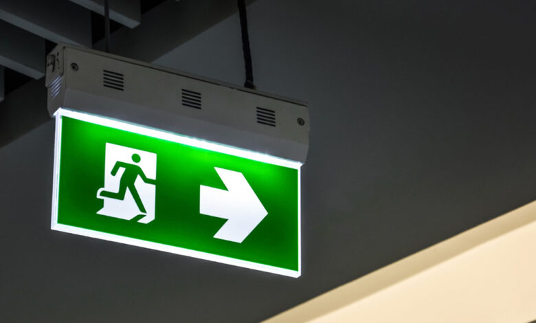
For example, blue is often used in hospital signage because it conveys trust and calm. Red, on the other hand, signifies urgency, which is why it’s common for warning or emergency signs. Fonts also influence user perception—serif fonts can feel more traditional and trustworthy, while sans-serif fonts often communicate clarity and modernity.
Sign design isn’t just about visual aesthetics; it’s about communication effectiveness.
Branding and Signage: Silent Ambassadors
A sign can speak volumes about a company before anyone steps through the door. Branded signs are often the first visual cue someone sees when approaching a business. From monument signs to lobby directories, every sign contributes to the brand identity.
The design elements used in these signs—logos, brand colors, typefaces—create consistency and recognition. In a crowded marketplace, consistency is critical. It builds familiarity and trust, which ultimately influences customer decisions.
DesignElement Raleigh understands how to balance branding with function, creating signage that serves both practical and promotional roles without overwhelming the viewer.
Materials That Match the Message
The material of a sign isn’t just about durability—it’s part of its message. A brushed metal sign suggests sophistication and permanence, while a wood sign might suggest warmth and approachability. Acrylic signs can communicate modernity and clarity, perfect for clean office spaces or healthcare settings.
Durability is especially important in exterior signs, where exposure to weather and sunlight can lead to fading, cracking, or peeling. Using UV-resistant materials and finishes ensures that signage maintains its look and legibility for years.
The choice of material also influences installation methods, lighting integration, and long-term maintenance costs.
Innovation in the Sign Industry
Technology is changing how we approach signage. Digital displays now allow for real-time updates in wayfinding systems, while QR codes on ADA signs can provide audio directions to enhance accessibility. Augmented reality applications are even beginning to appear in large campuses and airports, giving users an immersive navigation experience.
However, innovation should never come at the cost of clarity. In spaces where people need quick, reliable information—such as hospitals or transit stations—traditional, well-designed static signs remain unmatched in efficiency and trustworthiness.
A Thoughtful Finish
At the end of the day, signage is not just about guiding people—it’s about shaping their experience. When signs are designed with intention and installed with care, they do more than inform. They welcome. They protect. They include. And they leave a lasting impression.
DesignElement Raleigh continues to contribute to environments that work for everyone—whether it’s through expertly crafted ADA signs or thoughtful sign installation across a wide variety of settings. Their approach isn’t just about visibility—it’s about vision.