Your SaaS Website Is Losing Signups and Here Is Exactly Why
You spent months building the product. The code is clean, the problem it solves is real, and the people you have shown it to get it immediately. Then you put up a website and the signups are not coming. Not because the product is wrong. Because the website is doing almost none of the work a SaaS marketing site needs to do and most founders do not realize it until they have already burned through a significant chunk of their runway wondering why traffic is not converting.
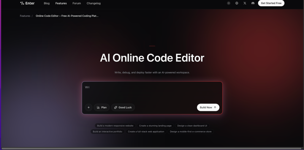
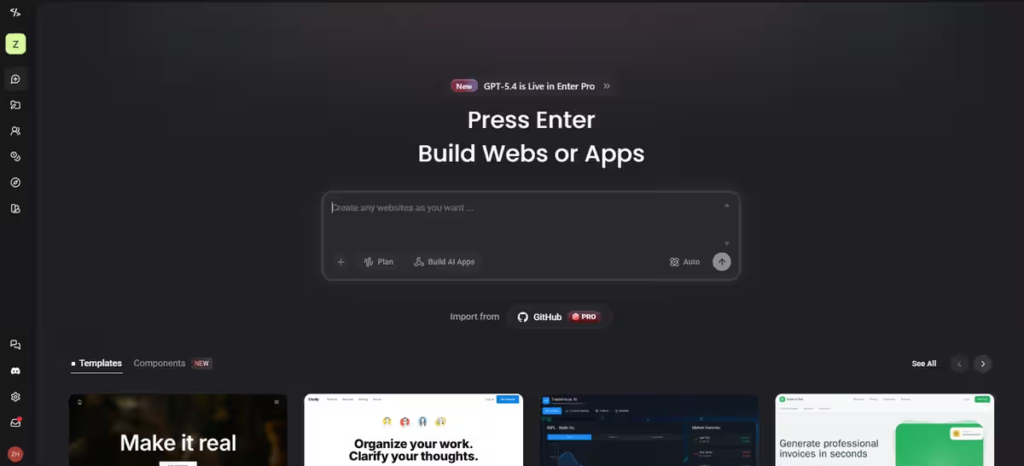
The gap between a product that works and a website that sells it is wider than most technical founders expect and it has almost nothing to do with design aesthetics. It has everything to do with understanding what a visitor needs to feel, understand, and believe before they are willing to hand over an email address or start a trial. Enter Pro is one of the platforms early-stage founders are using to build marketing sites that close that gap without the cost of a dedicated growth team. For founders who want precise control over landing page layouts, pricing table structures, or custom demo request flows, having a free code editor within the platform means those optimizations happen at the speed a startup actually needs to move.
The First Ten Seconds That Determine Everything
A SaaS visitor makes a decision about whether to keep reading within the first ten seconds of landing on your site. In that window they are asking one question in several different ways. What is this, who is it for, and does it solve something I actually have?
Most SaaS homepages fail this test in one of two ways. Either they are so abstract and jargon-heavy that a visitor cannot tell what the product actually does, or they are so feature-focused that a visitor understands what it does but cannot tell why it matters to them specifically.
The above-the-fold section of your homepage is doing the most important work on your entire site. A clear, specific headline that names the problem being solved. A subheadline that describes what the product does and who it is for. A visual that shows the actual product rather than a generic illustration. And a single clear call to action. That combination sounds simple and it is genuinely difficult to get right, but getting it right changes conversion rates more dramatically than almost any other single change a founder can make.
Writing for Your Customer Not Your Investor
There is a particular kind of SaaS copy that sounds impressive in a pitch deck and completely fails on a marketing website. Language about disrupting paradigms, transforming workflows end to end, delivering synergistic solutions for enterprise-scale challenges. This copy is written for investors and accelerator applications, not for the person at ten thirty on a Tuesday morning who is frustrated with the tool they are currently using and wondering if yours is better.
Your website visitor has a specific, concrete problem. They want to know whether your product solves it, how quickly they can get started, and whether it is worth the risk of switching from whatever they are currently using. Speaking to that directly, in plain language that sounds like a knowledgeable colleague rather than a pitch deck, converts far better than any amount of aspirational positioning language.
The founders who crack this distinction early consistently outperform technically superior products whose websites never make the translation from investor language to customer language.
Choosing a Platform That Moves at Startup Speed
A SaaS marketing website is not a finished product. It is a continuously tested and iterated artifact that should be changing based on what you learn from how visitors actually behave on it. The platform you build on needs to support that pace of change without every update becoming a development task.
Taking the time to work through a proper comparison of the best website maker options with a fast-moving startup context in mind reveals significant differences in how quickly you can test a new headline, add a new landing page for a different customer segment, update your pricing structure, or rebuild your homepage based on something you learned from a user interview. The right platform makes these changes fast enough to keep pace with how quickly your understanding of your customer evolves. The wrong one creates a bottleneck between insight and implementation that slows everything down.
The Pricing Page Psychology Most Founders Get Wrong
Pricing pages are one of the most consequential and most mishandled pages on any SaaS website. The decisions made here affect not just conversion rate but the quality and size of the customers you attract, how you are perceived relative to competitors, and how much friction exists between interest and commitment.
The most common mistake is treating the pricing page as purely informational. Here are the tiers, here are the features in each, here is the price. That format answers the question of what things cost without doing any of the work of justifying why the cost is worth it.
A pricing page that converts does something more. It anchors the visitor’s thinking by presenting options in a deliberate order. It highlights a recommended tier in a way that makes the decision feel guided rather than overwhelming. It addresses the most common objection, usually some version of “is this worth it for a business my size,” directly and specifically. And it makes the risk of starting feel as low as possible through free trials, money back guarantees, or no credit card required signals that reduce the perceived cost of giving it a go.
Showing Your Product Without Boring People With It
Product screenshots and demo videos are essential on a SaaS website and almost universally handled poorly. Either there are no visuals at all, which leaves visitors trying to imagine what they are buying, or there are walls of screenshots that show every feature in exhaustive detail, which overwhelms visitors who have not yet decided whether they care.
The right approach is selective and sequential. Show the one or two moments in the product experience that most directly demonstrate the core value being delivered. The before state and the after state. The moment where the pain the customer came with gets resolved. Not the full feature set, not the settings page, not the onboarding flow, just the thing that makes someone think yes, this is exactly what I need.
Enter Pro gives founders enough layout flexibility to present product visuals in sequences and formats that tell a story rather than just displaying screenshots side by side on a page. That narrative structure keeps visitors engaged with the product presentation long enough to reach the decision that they want to try it.
Building Credibility When You Have No Track Record Yet
Early-stage SaaS founders face a credibility problem that every other business type eventually solves through time and accumulated proof. You may have a handful of beta users, no published case studies, no press coverage, and no recognizable customer logos to put on your homepage. And you still need to convince a skeptical visitor that handing you their email address or their credit card is a safe and sensible thing to do.
The credibility signals available to early-stage founders are different but not weaker than those available to established players. Founder transparency, being specific and honest about where the product is and where it is going, builds trust with early adopters in a way that polished enterprise marketing never does. A public roadmap or changelog that shows active development demonstrates that there are real people behind this product who are shipping improvements regularly. Genuine quotes from beta users, even informal ones, carry weight when they are specific about what changed for them.
The founders who build the most loyal early user bases are almost always the ones who treated transparency as a feature rather than a vulnerability.
Conclusion
A SaaS marketing website is not a brochure and it is not a pitch deck. It is the first experience a potential user has with your product and the standard by which they judge whether exploring further is worth their time. Getting it right does not require a growth team or a conversion rate optimization agency. It requires a clear understanding of who you are building for, honest and specific language about what your product does for them, and a platform that lets you update and improve based on what you learn as quickly as your product itself evolves. The product got you this far. A website that does it justice is what gets you to the next stage.